Contact
Write to Us And We Would Be Happy to Advise You.
Do you have any questions, or would you like to speak directly with a representative?
By hqt
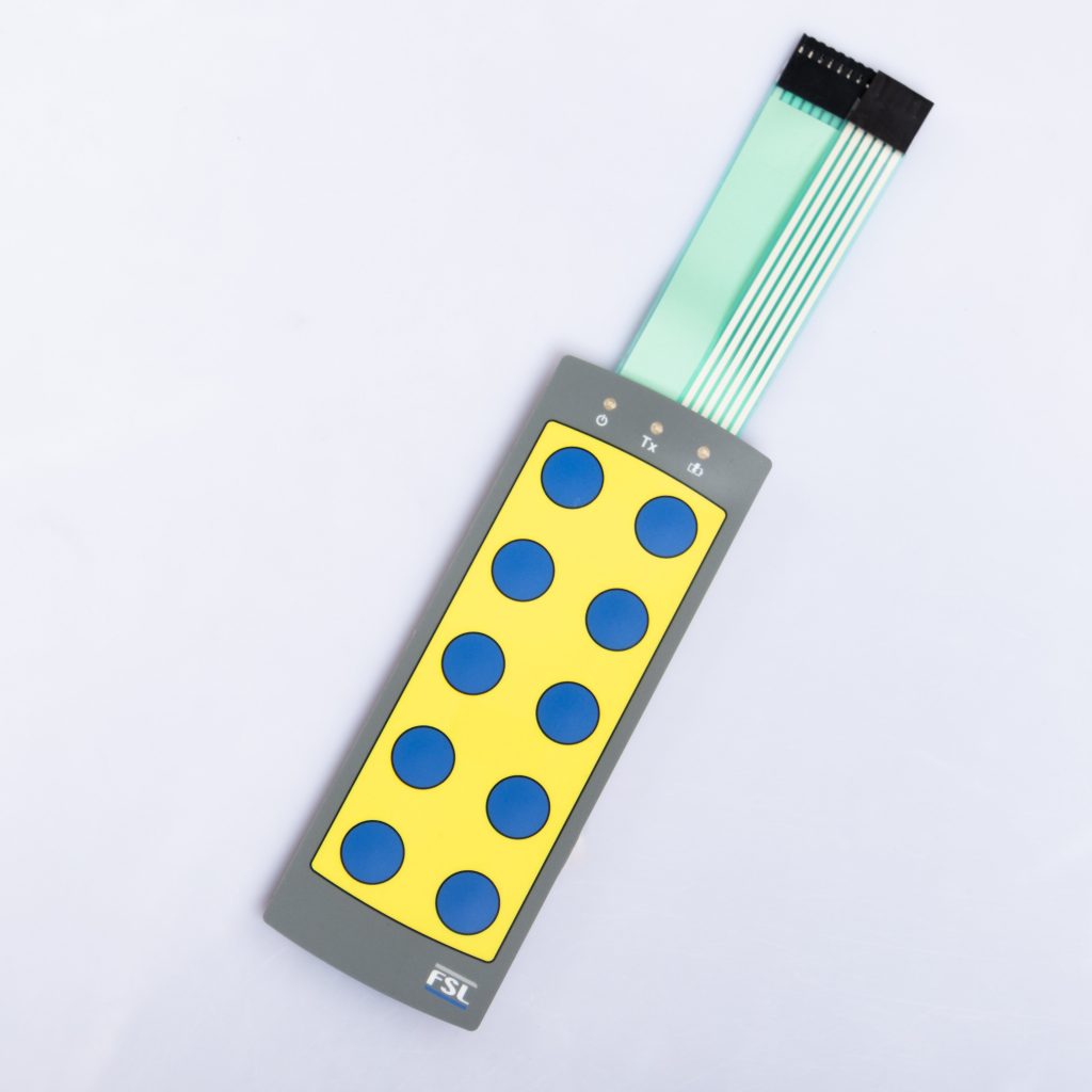
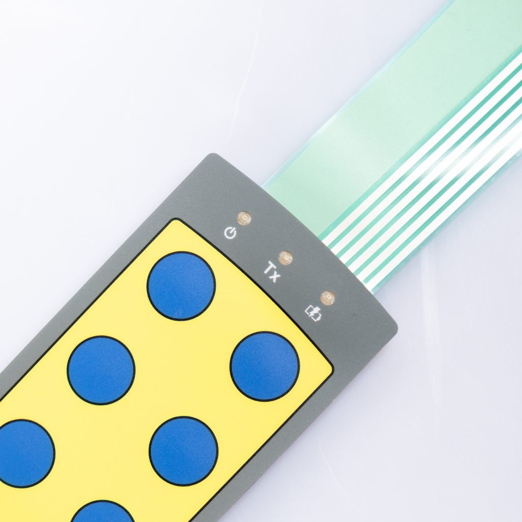
Color accuracy is crucial when designing membrane switches and graphic overlays. The right color combinations not only enhance the aesthetic appeal but also ensure functionality and brand consistency. This guide will walk you through essential tips for mastering color mixing in these critical components.


Before diving into color mixing, it’s important to understand the difference between CMYK and RGB color models. CMYK (Cyan, Magenta, Yellow, and Key/Black) is used in printing, while RGB (Red, Green, Blue) is used for digital displays. For membrane switches and graphic overlays, CMYK is typically the preferred choice because it provides more accurate color reproduction in printed materials.
Color matching ensures that the final product aligns with the intended design. Inaccurate color matching can lead to variations that may impact brand recognition and user experience. Use Pantone Matching System (PMS) colors to achieve consistent results. PMS colors are standardized and can be easily replicated across different printing processes, ensuring that your membrane switches and overlays maintain their intended look.
The substrate, or base material, plays a significant role in how colors appear on the final product. Different materials absorb and reflect light differently, which can alter the perceived color. For example, colors on a matte finish may appear duller compared to a glossy finish. Always test your color choices on the actual substrate to ensure they meet your expectations.
When working with membrane switches and graphic overlays, layering inks can help achieve vibrant and accurate colors. Start with lighter colors and gradually layer darker ones. This technique prevents color muddiness and ensures that each hue stands out clearly. Be cautious with the number of layers, as too many can cause the inks to blend unintentionally, leading to an undesired outcome.
Several common mistakes can occur during the color mixing process. One of the most frequent is failing to account for the interaction between different colors. For instance, mixing complementary colors can result in a neutral or muddy appearance. Another mistake is not considering the transparency of inks, which can affect how colors overlay and mix. Always conduct small-scale tests before committing to a large production run.
Colors can look different under various lighting conditions. A color that appears vibrant under natural light might look dull under fluorescent lighting. To ensure consistency, test your membrane switches and graphic overlays under multiple lighting environments. This step helps in identifying any potential issues before mass production begins.
Special effects, such as metallic inks or textured finishes, can add a unique touch to your membrane switches and graphic overlays. These effects, however, can also influence the final color appearance. For example, metallic inks may appear darker when applied over certain colors. Experiment with different combinations to find the perfect balance between special effects and color accuracy.
Once you’ve achieved the desired color mix, maintaining consistency across multiple production batches is crucial. Document the exact mixing ratios, ink types, and application techniques used. This documentation ensures that future batches will match the original, preventing any discrepancies that could affect the overall quality and appearance of your product.
By following these tips, you can master the art of color mixing for membrane switches and graphic overlays. The right approach not only enhances the visual appeal but also ensures that the final product meets your functional and branding requirements.
Do you have any questions, or would you like to speak directly with a representative?