Contact
Write to Us And We Would Be Happy to Advise You.
Do you have any questions, or would you like to speak directly with a representative?
By hqt
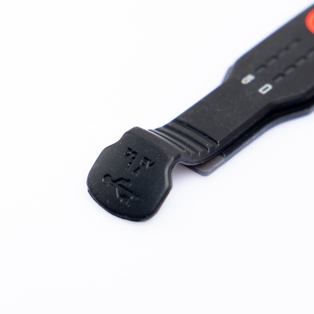
When it comes to electronic devices and appliances, one of the most important aspects is the user interface. And within the realm of user interface design, the color design of rubber keypads plays a significant role in enhancing both the aesthetics and functionality of the device. Rubber keypads are widely used in various industries, including automotive, consumer electronics, medical devices, and industrial equipment. In this article, we will explore the importance of color design in rubber keypads and how it can impact the user experience. So let’s dive in and discover the fascinating world of color design for rubber keypads!


Color design in rubber keypads serves multiple purposes, extending beyond mere aesthetics. It not only contributes to the visual appeal of the device but also has a significant impact on the user experience. The choice of colors can evoke certain emotions, enhance readability, aid in navigation, and provide visual cues to the user. Furthermore, color design can also help differentiate between various functions and improve the overall usability of the device.
In today’s competitive market, aesthetics play a crucial role in attracting and retaining customers. The color design of rubber keypads can make a substantial difference in the overall appearance of a device. By carefully selecting the right colors, manufacturers can create visually appealing products that stand out from the crowd. Vibrant and eye-catching colors can instantly grab the user’s attention, creating a positive impression and fostering a sense of desirability.
Moreover, the use of complementary colors and color gradients can add depth and dimension to the rubber keypad, making it visually appealing and enhancing the overall aesthetics of the device. By considering factors such as brand identity, target audience, and product positioning, manufacturers can leverage color design to create a cohesive and visually striking user interface.
Readability is paramount when it comes to user interfaces. The color design of rubber keypads can significantly impact the legibility of labels, symbols, and alphanumeric characters. Contrast plays a crucial role in ensuring readability, and the right color combination can make all the difference. High contrast between the key surface and the printed markings can enhance visibility, even in low-light conditions or for users with visual impairments.
To ensure optimal readability, manufacturers must carefully select colors that offer sufficient contrast while maintaining a harmonious and aesthetically pleasing design. This requires considering factors such as the reflectivity of the rubber keypad, lighting conditions in which the device will be used, and the viewing angles of the user.
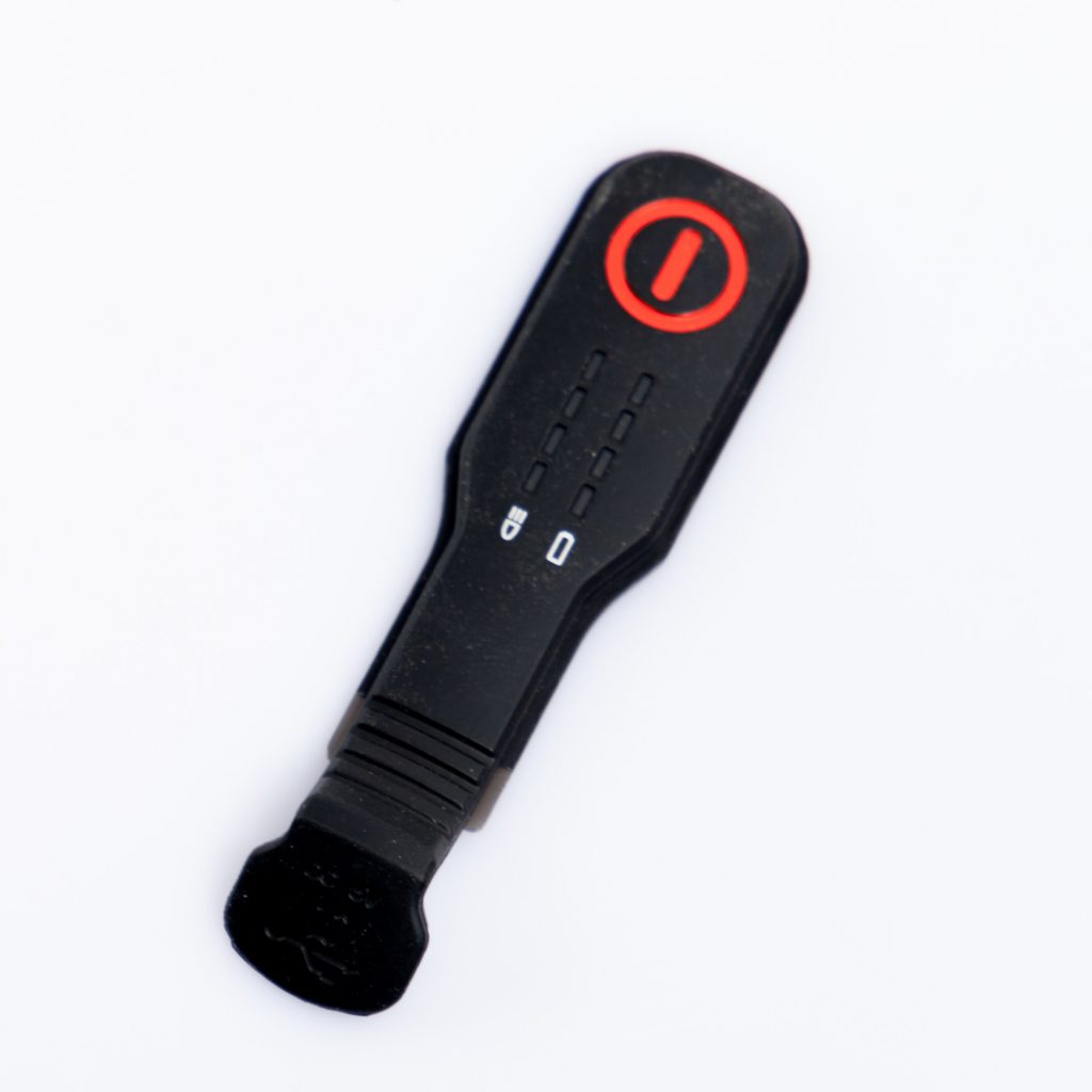
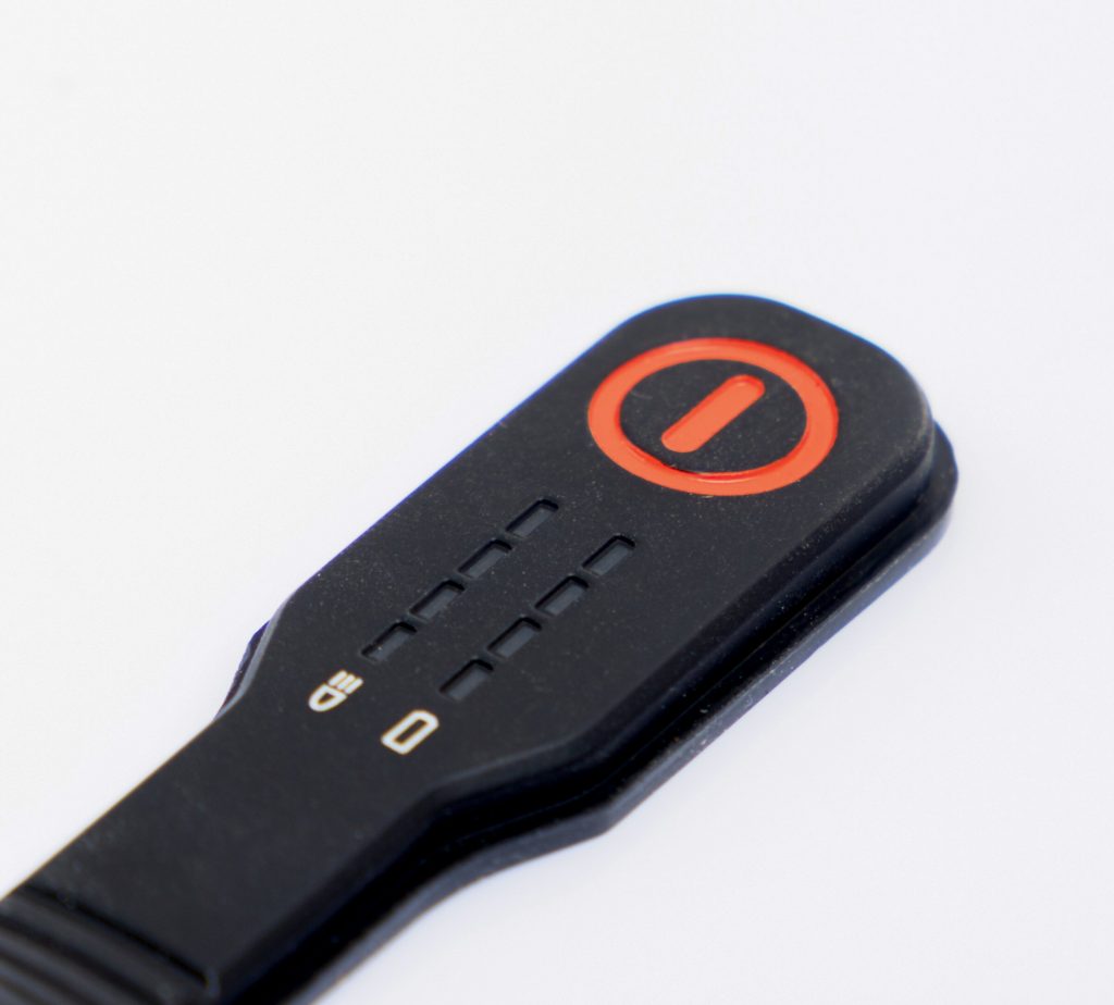
Color design can aid in navigation and improve the overall user experience by providing visual cues and differentiating between various functions. By assigning different colors to different sections or groups of keys, users can easily identify and locate the desired functions without confusion. For example, in a remote control, the power button can be distinguished by its unique color, allowing users to find it quickly and intuitively.
Additionally, color design can also be used to signify the activation or deactivation of certain functions. For instance, a red-colored “stop” button on a medical device indicates an emergency action, ensuring a prompt response from the user. By leveraging color as a visual language, manufacturers can simplify the user interface and make it more intuitive, leading to a better user experience.
Now that we understand the significance of color design in rubber keypads, let’s delve into the various factors that should be considered when designing the color scheme for a device.
The color design of rubber keypads should align with the brand identity and product positioning. The colors chosen should reflect the brand’s values, evoke the desired emotions, and resonate with the target audience. For example, a brand targeting a young and tech-savvy demographic may opt for vibrant and bold colors, while a brand catering to a professional audience might choose more subdued and sophisticated hues.
Colors have the power to evoke specific emotions and influence human behavior. Understanding color psychology is essential in selecting the right colors for rubber keypads. For instance, blue is often associated with trust and reliability, making it suitable for medical devices or security systems. On the other hand, green can represent nature and health, making it ideal for fitness equipment or environmental monitoring devices.
By carefully considering the emotional impact of colors, manufacturers can create user interfaces that resonate with users on a subconscious level, enhancing their overall experience and perception of the product.
When designing the color scheme for rubber keypads, usability and accessibility should be key considerations. The colors chosen should ensure optimal readability and visibility for all users, including those with visual impairments or color blindness. Designers should pay attention to contrast ratios, font sizes, and the legibility of printed markings to ensure that the user interface is accessible to a wide range of individuals.
Different industries may have specific standards and regulations regarding the color design of rubber keypads. For instance, medical devices may need to adhere to color-coding standards for different functions or safety features. It is crucial for manufacturers to familiarize themselves with industry-specific guidelines and ensure compliance when designing the color scheme for their devices.
A: When selecting a color combination, consider factors such as brand identity, target audience, readability, and emotional impact. It’s also helpful to conduct user testing and gather feedback to ensure the chosen colors resonate with the users.
A: Yes, color design plays a significant role in shaping the perception of quality. A well-executed color scheme can make a device appear more premium and reliable, enhancing the overall user experience.
A: Some industries, such as automotive and medical devices, may have specific color standards or color-coding requirements. It is essential to research and adhere to industry guidelines to ensure compliance.
A: Color design can aid in navigation, differentiate between functions, and provide visual cues, thereby improving the usability and user experience of the device.
A: While it may be possible to change the color design after manufacturing, it can be a complex and costly process. It is advisable to plan and finalize the color scheme during the initial design stages.
A: Absolutely. It is essential to ensure sufficient contrast, legibility of text, and visibility of the user interface for individuals with visual impairments or color blindness.
The color design of rubber keypads is a critical aspect of user interface design. By carefully selecting colors that enhance aesthetics, readability, and usability, manufacturers can create visually appealing and user-friendly devices. The right color scheme can evoke emotions, aid navigation, and improve the overall user experience. With the right combination of colors, manufacturers can make their devices stand out in the market and leave a lasting impression on users.
So, when designing your next electronic device or appliance, remember the power of color design in rubber keypads. By investing time and effort into creating an engaging and visually striking user interface, you can elevate the overall product experience and establish a strong connection with your target audience.
Do you have any questions, or would you like to speak directly with a representative?